- Module Library
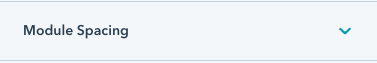
See module spacing.

See background.
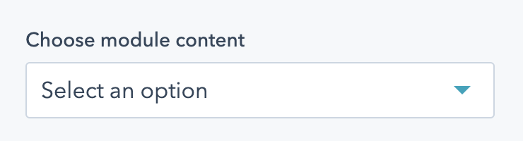
Choose what content to include in your multi-column module. Options are:
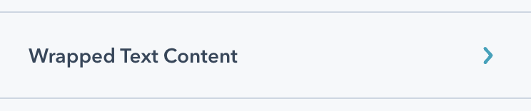
Appears if "Wrapped text" is selected under Module Content. Holds all the fields to add wrapped text to your module.
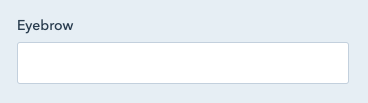
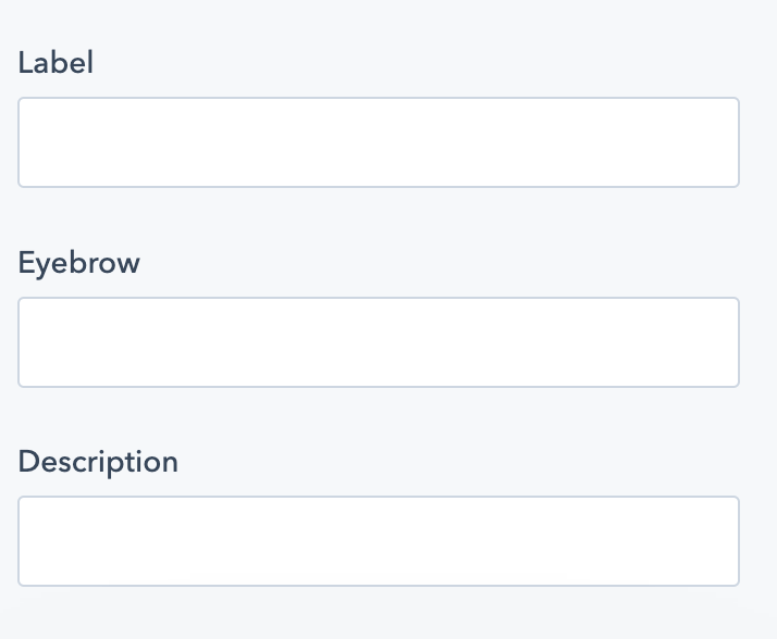
In the "Wrapped Text Content" dropdown. Add an eyebrow to your module. The eyebrow will be in all caps, and be smaller text above the heading. Note that eyebrows should be short - just a few words, and not a full sentence.

See heading. In the "Wrapped Text Content" dropdown.
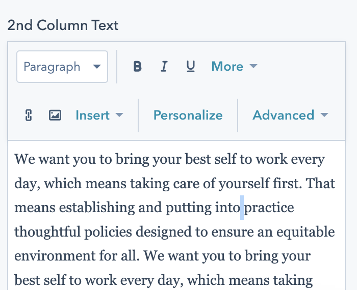
In the "Wrapped Text Content" dropdown. Copy for the middle column of your wrapped text module.
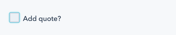
In the "Wrapped Text Content" dropdown. Check this box to add a quote in your module. This quote will appear in the third column.
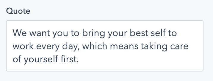
In the "Wrapped Text Content" dropdown. Appears if "Add quote" is checked. This quote will always appear in the H2 style, and quotation marks will be added automatically.
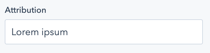
In the "Wrapped Text Content" dropdown. Appears if "Add quote" is checked. Add quote attribution here, and a dash "-" will be added automatically.
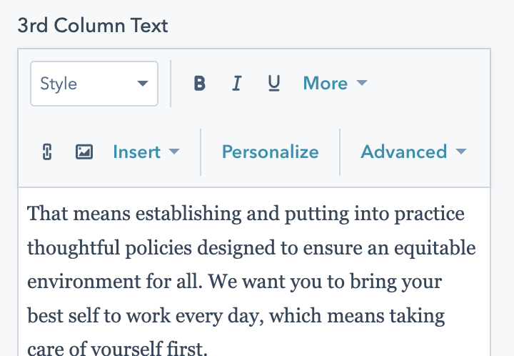
In the "Wrapped Text Content" dropdown. Copy that will appear in the third column of your wrapped text module.
See CTA. In the "Wrapped Text Content" dropdown. Add CTAs to your wrapped text content- note that these CTAs will appear in the first column under your heading.
Appears if "Text Columns", "Stats with description", or "Images & Text" is selected under "Module Content". Check this box to add an introduction to your section.
Appears if "Text Columns", "Stats with description", or "Images & Text" is selected under "Module Content", and "Add introduction" is checked. Holds all the fields for adding an introduction to your content.
See heading. In the "Introduction" dropdown.
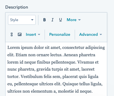
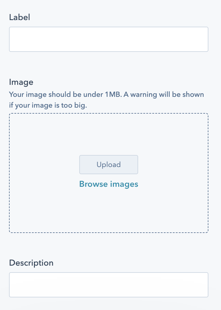
Add a description to your introduction.
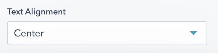
In the "Introduction" dropdown. Select how your introduction should be aligned. Options are:
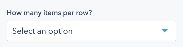
Appears if "Text Columns" or "Images & Text" is selected under "Module Content". Select a number of items per row. Options are 3 or 4.
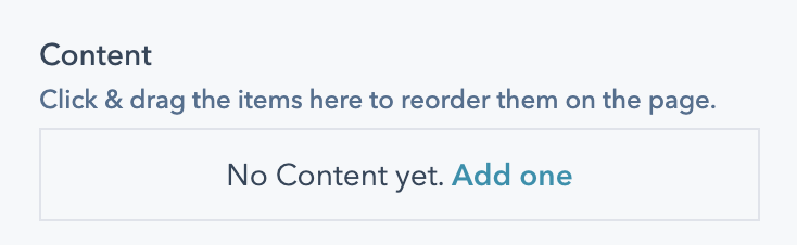
Appears if "Text Columns", "Stats with description", or "Images & Text" is selected under "Module Content". Holds all the repeated items in your module. Click & drag to rearrange the items.
Appears in the Content item if "Text Columns" is selected under "Module Content". Options are:
Appears if "Text Columns", "Stats with description", or "Images & Text" is selected under "Module Content", and within a Content item.
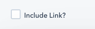
Check this box to link your content item.
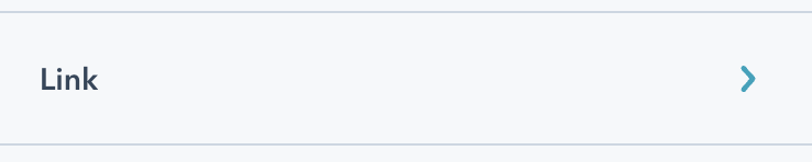
Appears if "Text Columns", "Stats with description", or "Images & Text" is selected under "Module Content", and within a Content item. Only appears if "Add Link" is checked.
This dropdown holds options for linking your section of content. Options are a URL or a Modal. For more on how this works, see the CTA field.
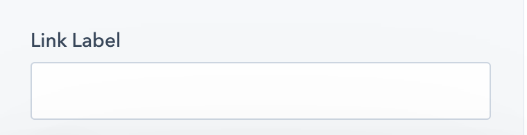
Appears if "Text Columns", "Stats with description", or "Images & Text" is selected under "Module Content", and within a Content item. Only appears if "Add Link" is checked.
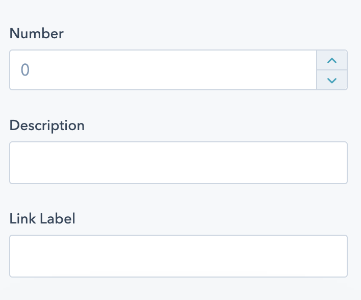
Add a link label to your item. This will display different depending on the layout of your content.

Appears if "Stats with description" is selected under "Module Content".
Check this box to animate the stats on scroll. When the user scrolls to these stats, they'll animate up to their final number from zero. Not recommended if your module is above the fold, or if one of your numbers is less than 10.
Appears in the Content item if "Text Columns" is selected under "Module Content". Options are:
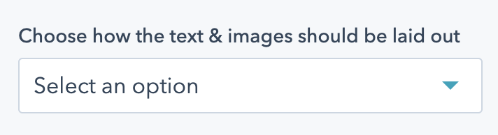
Appears if "Images & Text" is selected under "Module Content". Choose how your images & text should be laid out. Options are:
Appears if "Images & Text" is selected under "Module Content", and if "Image on top" is selected as the image layout.
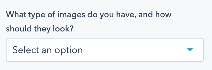
You should select an option in this field based on the types of images you have available for this section. Note that this setting will apply to all content items within the module.
Options are:
Appears if "Images & Text" is selected under "Module Content", and if "Image on top" is selected as the image layout.
Choose how the text should be aligned in all of your images. Options are:
Appears if "Images & Text" is selected under "Module Content" as the content item options. Options are:
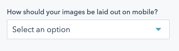
Appears if "Images & Text" is selected under "Module Content".
Choose how your module should be laid out on mobile screens. Options vary based on the value in "Image & Text layout".
If you have "Image on top" selected, options are:
If you have "Image background" selected, options are:

See Anchor.