- Module Library
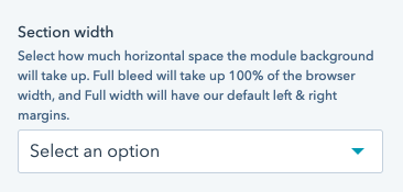
See section width.
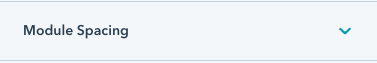
See module spacing.
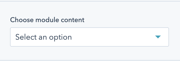
Choose the content of your module. Options are:

See background. This field applies to the background of the content block as a whole, not each individual column.
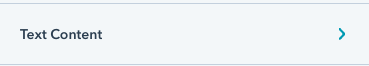
Appears if "Two Column Text" is selected under "Module Content". Holds all the text fields for the module.
Appears if "Two Column Text" is selected under "Module Content", and appears under "Text Content". Add an eyebrow to your module. The eyebrow will be in all caps, and be smaller text above the heading. Note that eyebrows should be short - just a few words, and not a full sentence.

See heading. Appears if "Two Column Text" is selected under "Module Content", and appears under "Text Content".
Appears if "Two Column Text" is selected under "Module Content", and appears under "Text Content". The body copy for your text content.
Appears if "Two Column Text" is selected under "Module Content", and appears under "Text Content". Choose how large the description content should be.
Options are:

Appears if "Alternating Content" is selected under "Module Content". Will hold the content options for each column. The column on top will appear on the left - you can click & drag to redorder the two columns here.
As this is a 2 column module, there is a maximum of 2 items that can be added here.

Appears if "Alternating Content" is selected under "Module Content", and within the individual item under "Column".
Select the content type for this column. Options are:
Appears if "Alternating Content" is selected under "Module Content", and within the individual item under Column if Image is selected as the column content type.
Select an image to add to your module. The image will take up the full background of this half of the module. The middle of the image is displayed, so content around the edge of your image might not appear on all screen sizes.
See background.Appears if "Alternating Content" is selected under "Module Content", and within the individual item under Column if Text, Stats, Bullets, Quote, or Form is selected as the column content type. Is further nested within the "Content" dropdown.
Will apply a background to this column of the module.
Appears if "Alternating Content" is selected under "Module Content", and within the individual item under Column if Text, Stats, Bullets, Quote, or Form is selected as the column content type. Is further nested within the "Content" dropdown.
Add an eyebrow to this half of your module. The eyebrow will be in all caps, and be smaller text above the heading. Note that eyebrows should be short - just a few words, and not a full sentence.
See heading. Appears if "Alternating Content" is selected under "Module Content", and within the individual item under Column if Text, Stats, Bullets, Quote, or Form is selected as the column content type. Is further nested within the "Content" dropdown.
This column is a Quote, the heading will be the quote itself, and quotation marks will be added automatically.

Appears if "Alternating Content" is selected under "Module Content", and within the individual item under Column if Quote is selected as the column content type. Is further nested within the "Content" dropdown.
Add an attribution to your quote. Note that a "-" will be added automatically.
Appears if "Alternating Content" is selected under "Module Content", and within the individual item under Column if Text, Stats, Bullets, or Form is selected as the column content type. Is further nested within the "Content" dropdown.
Appears if "Alternating Content" is selected under "Module Content", and within the individual item under Column if Text, Stats, or Bullets is selected as the column content type. Is further nested within the "Content" dropdown.
Choose how large the description content should be.
Options are:
See CTA. Appears if "Alternating Content" is selected under "Module Content", and within the individual item under Column if Text, Stats, or Bullets is selected as the column content type.

Appears if "Alternating Content" is selected under "Module Content", and within the individual item under Column if Video is selected as the column content type.
Check this box if you'd like to add a moving video preview to this column of the module. This video preview will be muted, looped, and only play on desktop.
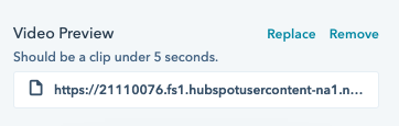
Appears if "Alternating Content" is selected under "Module Content", and within the individual item under Column if Video is selected as the column content type.
Select an image to use as a video preview. It's recommended the image be a screengrab from your video. The middle of the image is displayed, so content around the edge of your image might not appear on all screen sizes.
Note that a video will take up 70% of the module, not 50%, to retain usual video aspect ratios.
Appears if "Alternating Content" is selected under "Module Content", and within the individual item under Column if Video is selected as the column content type. Will only appear if "Add video preview" is checked.
Select a file for your video preview. This video preview file should be an mp4 uploaded to the HubSpot file manager, and be fairly short. A longer clip is detrimental to the load time of your page.
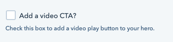
Appears if "Alternating Content" is selected under "Module Content", and within the individual item under Column if Video is selected as the column content type.
Check this box if you'd like to add a video CTA. This is recommended, so that you can trigger a modal to play the video.
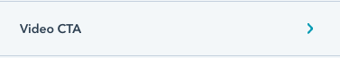
See video CTA for options. Appears if "Alternating Content" is selected under "Module Content", and within the individual item under Column if Video is selected as the column content type. Needs "Add a video CTA?" to be checked to appear.
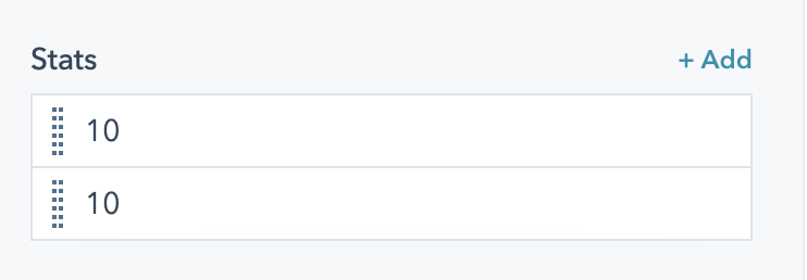
Appears if "Alternating Content" is selected under "Module Content", and within the individual item under Column if Stats is selected as the column content type.
Add stats to your module. Each stat supports a number and a label.
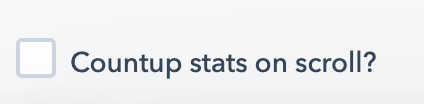
Appears if "Alternating Content" is selected under "Module Content", and within the individual item under Column if Stats is selected as the column content type.
Check this box to animate the stats on scroll. When the user scrolls to these stats, they'll animate up to their final number from zero. Not recommended if your module is above the fold, or if one of your numbers is less than 10.
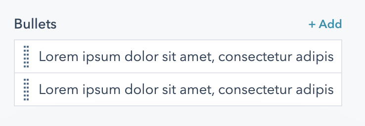
Appears if "Alternating Content" is selected under "Module Content", and within the individual item under Column if "Text with bullets" is selected as the column content type.
Add bullets to your column. Brings up a simple text field to add content. By default, these bullets are in an unordered list.
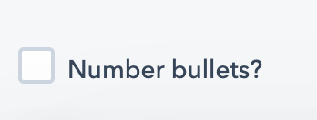
Appears if "Alternating Content" is selected under "Module Content", and within the individual item under Column if Text with Bullets is selected as the column content type.
Check this box to turn your bulleted list into a numbered list.
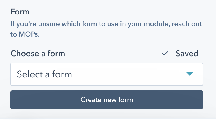
Appears if "Alternating Content" is selected under "Module Content", and within the individual item under Column if Form is selected as the column content type.
Add a form to this side of your module. Note that forms will only take up 30% of a column, pushing the other column to 70% of the module. If you're unsure which form to add to your module, reach out to MOPs.

See Anchor.