- Module Library
The fields listed below are used repeatedly across all modules. They're also designed to scale - new options can be added without breaking existing content. As new options are added to these fields, this page will be updated.

As you move through different dropdowns, sometimes the entire left sidebar in the page editor will be replaced with the current fields. You can use the Breadcrumbs at the top (screenshot above) to navigate back to other parts of the module.
By default, the Background dropdown is collapsed. Click it to reveal options for your module's background. Click it again to re-collapse.
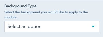
Here you can select the type of background you'd like applied. Options are:
If you select Black, White, Gray or Rubine, your text color will be automatically set based on the background. If you select "Background Image", more options will appear.

Select a background image. This option will only appear if you've selected "Background Image" under "Background Type".
If your image is greater than 1MB in size, it will be detrimental to the loading time of your page. Use tinypng to compress your image if it's over 1MB- a warning will show above the field if your image is too large.
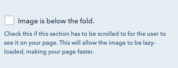
Check this box if your image has to be scrolled to by the user to see it. This will "lazy-load" your image, meaning it won't be loaded by the browser until just before the user reaches it.
This is critical for the speed of your page, and has no negative repercussions for the user experience.
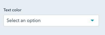
If you're adding a background image, you'll need to select what color the text should be. This option will only appear if you've selected "Background Image" under "Background Type".
Choose the option that makes your text the most legible for the user. Note that if neither option makes the text legible, you should pick a different background image.
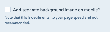
Not recommended. In some cases, you may need a separate background image for mobile screens. This is discouraged - it forces the browser to load two different images for one module, which is detrimental to your page speed.
If you check this box, a new image field will appear where you can add a mobile image. If you're using the same image on desktop and mobile, no need to check this box.
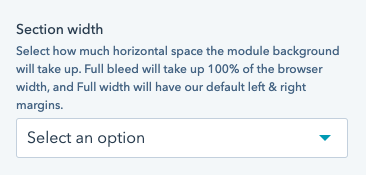
Select how wide your section should be. A "Section" is the entire outmost wrapper of a module.
Full bleed sections will go from edge to edge of the browser, no matter the browser side.
Full width sections will only extend just past the content max width, with white space around it on all screens.
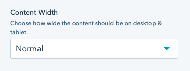
Select how wide your content should be. "Content" is usually text, and it fits within the section. Content options may vary based on the module.
Note that all content is the same width on mobile.

By default, the Heading dropdown is collapsed. Click it to reveal options for your module's heading. Click it again to re-collapse.
Type your heading in here. Note that this is a simple text field - it's not recommended to add links or images in headings, so this is intentionally not available.
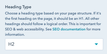
In browsers, there are 6 levels of Headings. The level of a heading tells crawlers & screen readers how this section of content fits within the rest. Heading 1, or an H1, is most important, and there should only be one per page. Heading 6, or an H6, is least important (and there can be many per page).
It's best to choose your content types based on the hierarchy of your copy. It might help to think of it as an outline:
This will not impact the style of your heading, but is critical for SEO and web accessibility.
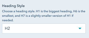
We have 7 styles of Headings in our BetterUp Brand. The largest is H1. The second largest is H7. The third largest is H2, fourth largest H3, etc.
Feel free to select any option here to see how it appears on your page. H2, H3, and H7 are the most commonly used options.
By default, the Modal dropdown is collapsed. Click it to reveal options for your module's modal. Click it again to re-collapse.
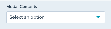
Select what your modal should contain. Options are:
If you select "Form" or "Video with Copy & CTA" under "Modal Contents", this field will appear.
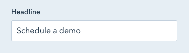
For "Form", this is a title that will appear above the form.
For "Video with Copy & CTA", this will appear above the copy on the right.
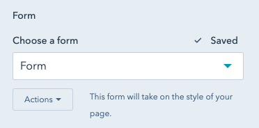
If you've selected "Form" under "Modal Contents", you'll see a field to select your form. Consult with MOPs to determine which form is needed on your page.
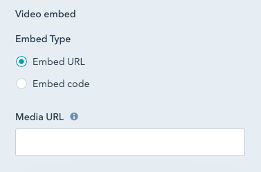
If you select "Video" or "Video with Copy & CTA" under "Modal Contents", you'll see an option to add your video.
If you select the "Embed URL" option, you can just paste the URL of your video from Vimeo or YouTube. This is the simpler, recommended option.
If you select the "Embed code" option, you'll be expected to add a full embed code for your video. This embed code usually begins with "<iframe".
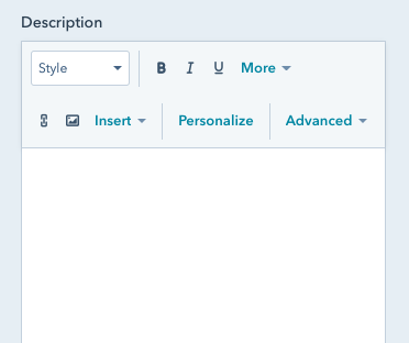
If you select "Video with Copy & CTA" under "Modal Contents", this field will appear. You can input a description for the right side of your modal.
While the options are available, it's not recommended to update the font sizes in this section. This may result in font sizes that are not legible to the end user.
If you have added formatting here, like a font size, go to "Advanced" and "Source Code", then remove everything to start over.
If you select "Video with Copy & CTA" under "Modal Contents", this field will appear. Here you can add a link to your modal - it will appear under the copy on the right.
Under "Link to", you can select the content to send your user to. Options are:
Additionally, select "Open in New Window" to open the link in a new tab.
Selecting the "no follow" option will tell search engines not to index this link. It is uncommonly used, and should only be checked with guidance from SEO.
If you select "Video with Copy & CTA" under "Modal Contents", this field will appear. Here you can add a tracking class to the link in your modal. Usually this tracking class is used in Google Tag Manager or HubSpot. If you'd like to track clicks on this link, reach out to the CRO team.
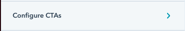
If your module supports CTAs, you'll see this option "Configure CTAs". Click it to see more about adding CTAs to your module.
Once you've clicked, the rest of the contents of the sidebar won't be visible. Use the breadcrumbs at the top of the sidebar (under the Exit button/"Run a Test" and above the module name) to navigate back.

All modules that support CTAs support dual CTAs (two buttons next to eachother).
Check "Include CTA?" to add a single CTA. The options for this first CTA will be available in the "CTA" dropdown.
Check "Include Second CTA?" to add a second CTA. The options for this second CTA will be available in a "Second CTA" dropdown.
Note that the "CTA" and "Second CTA" dropdowns will only appear if the related checkbox is checked. Both dropdowns have identical contents, with each applying to it's own CTA.

Select how you'd like to include a CTA. Options are:
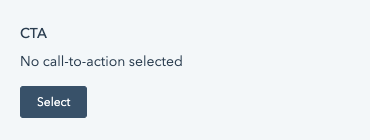
If you select "HubSpot CTA" under "Link Type", this field will appear. You can select a HubSpot CTA from the CTA tool. You can also create a new CTA if necessary.
Using a CTA is great if you want an easy way to track clicks on this button. Note that those clicks will be tracked in the same place for everywhere you add this HubSpot CTA.
For more on how to create a HubSpot CTA, see here. It's recommended you select "Link (No style)" under "Button Style".
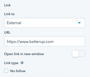
If you select "URL" under "Link Type", this field will appear.
Under "Link to", you can select the content to send your user to. Options are:
Additionally, select "Open in New Window" to open the link in a new tab.
Selecting the "no follow" option will tell search engines not to index this link. It is uncommonly used, and should only be checked with guidance from SEO.

Will appear if you select "URL" or "Modal" under "Link Type". This is the label of your button.
Here you can add a tracking class to your CTA. Usually this tracking class is used in Google Tag Manager or HubSpot. If you'd like to track clicks on this link, reach out to the CRO team.
Select how your button should appear. Options are:
If your module supports a Video CTA, you'll see this option "Video CTA". Click it to see more about adding a video CTA to your module. Note that, depending on the module, you may need to check an option "Include Video CTA?" to make this appear.
Once you've clicked, the rest of the contents of the sidebar won't be visible. Use the breadcrumbs at the top of the sidebar (under the Exit button/"Run a Test" and above the module name) to navigate back.

This will the label of your video CTA. If left blank, only a "play" button will appear.
Choose what color your video play button & text should be. Usually, this should be the same color as the text in your module, and the most legible option. Options are:
Here you can add a tracking class to your video CTA. Usually this tracking class is used in Google Tag Manager or HubSpot. If you'd like to track clicks on this link, reach out to the CRO team.
By default, the module spacing dropdown is collapsed. Click it to reveal options for your module's spacing. Click it again to re-collapse.
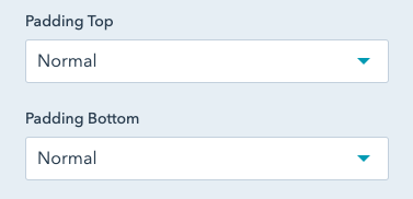
Padding increases the space between your module's content and the top or bottom of your module. If you have a background, this will show more of the background above or below your content.
Options are:
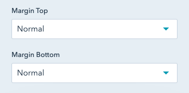
Margin increases the space between your module and the module above or below it. If you have a background, this will increase the space between the edge of your background and the module above. Margins will appear as white space.
Options are:

Usually, links appear where an entire section of a module can be linked - like a card or a blurb - and a button does not appear. If you're expecting a button to appear, use the CTA field.
If your section supports a link, you'll see this option "Link". Click it to see more about adding a link to your section.
Once you've clicked, the rest of the contents of the sidebar won't be visible. Use the breadcrumbs at the top of the sidebar (under the Exit button/"Run a Test" and above the module name) to navigate back.
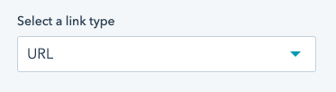
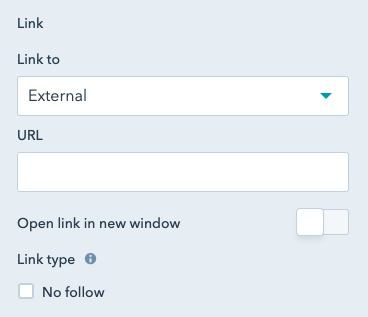
Select a link type. Options are:
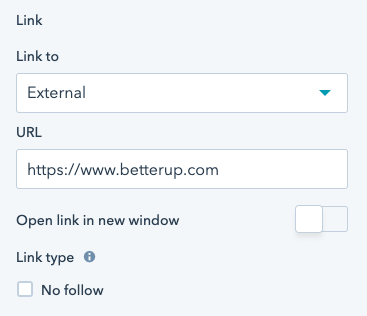
If you select "URL" under "Link Type", this field will appear.
Under "Link to", you can select the content to send your user to. Options are:
Additionally, select "Open in New Window" to open the link in a new tab.
Selecting the "no follow" option will tell search engines not to index this link. It is uncommonly used, and should only be checked with guidance from SEO.
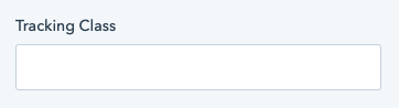
Here you can add a tracking class to your linked section. Usually this tracking class is used in Google Tag Manager or HubSpot. If you'd like to track clicks on this link, reach out to the CRO team.
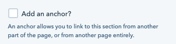
Check this box to add an anchor to your module. An anchor allows this section of the page to be linked to directly, from either the page itself or another page entirely.
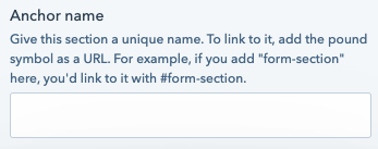
Name your anchor. You'll use this to link to the module section.
For example, if you put my-anchor-name in this field, you could link to this section on this same page with #my-anchor-name as a URL (no other information needed). To link to this section from another page, add #my-anchor-name to the full URL.