2 Column Carousel

BetterUp's Cards 2 Column Carousel module inherits all the features of the 2 Column Module while introducing a carousel functionality and the option to display content in a "2 Column Accordion" layout for the iPhone slider.

Usually, each column under this module takes up 50% of the available space. Exceptions to this are:

  • A video column - a video column will take up 70% of the available space, and the other column will take up 30%. This is to retain usual video aspect ratios.

Fields

  • Background
    Background

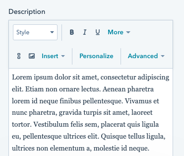
    See background. Note that the Cards module only supports a black, white, or gray solid background, as the cards themselves have a background image.

  • Module Spacing
    Module spacing
  • Screenshot 2024-02-07 at 9.23.30 AM
    Slider type

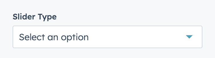
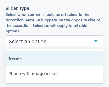
    Select a slider type. Options are:

    • 2  Column Standard  - both slides change when slider is scrolled. 
    • 2 Column Accordion - one side has an image or device, one side has an accordion. The image or device changes when the accordion items are hovered.
  • Screenshot 2024-02-07 at 9.41.06 AM
    Section width

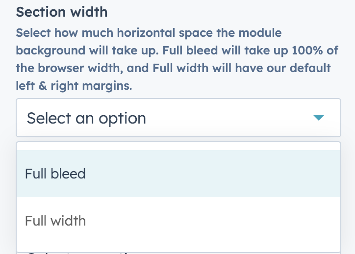
    Select section width, options are:

    • Full Bleed
    • Full Width 
  • Screenshot 2024-02-07 at 9.28.46 AM
    Slider Navigation Color

    Appears if  "Section Width" is "Full Bleed".

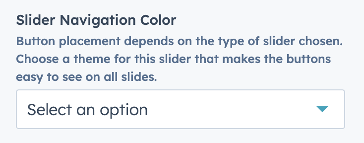
    Select navigation color. Options are:

    • Dark
    • Light
  • Screenshot 2024-02-26 at 5.20.09 PM
    Slider Background

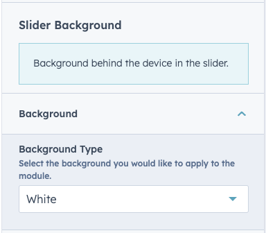
    All standard background colors and the ability to add a background image. This is visible when the "2 Column Accordion" option is selected and controls the are behind the phone slider.

  • Screenshot 2024-02-26 at 5.29.06 PM
    Slider Type (2 Column Accordion)

    Choose the type of 2 column accordion slider you'd like to have, options are:

    • Image
    • Phone with image inside

    Image is great for displaying product images and photography. Phone with image inside is great for displaying product images on a cell phone, specific dimensions are:

    • 659 px × 1427px dimensions
    • images must be without iPhone container/frame (see example here)
    • Only iPhones are supported in this option - if you'd like to feature another device screenshot please use the "Image" option and look to use an image with whitespace around it (see example here)
  • Screenshot 2024-02-27 at 3.30.19 PM
    Accordion Side Content (2 Column Accordion)

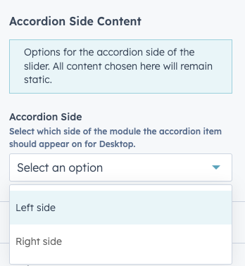
    Choose the which side of the screen the accordion will display on, options are:

    • Left
    • Right

    Once a side is chosen you will be able to populate content in the Background, Eyebrow, Heading, Description and CTA fields.

  • Screenshot 2024-02-27 at 3.53.05 PM
    Eyebrow
    Repeatable 2 column slides. If "2 Column Standard" is selected. These slides are made up of two elements, where you have the ability to set each column independently. 
  • Heading
    Heading

    See heading.

  • Description
    Description
    In the introduction dropdown. Add a description to your introduction.
  • Screenshot 2024-02-27 at 3.39.05 PM
    Mobile Image (2 Column Accordion)

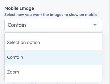
    This field will appear if the "Phone with image inside" option is selected, options are:

    • Contain
    • Zoom

    Contain will ensure that the image is fully visible on smaller devices and Zoom will slightly enlarge the product image which sometimes adds to the design.

  • Screenshot 2024-02-27 at 3.43.44 PM
    Accordion Slides (2 Column Accordion)

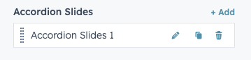
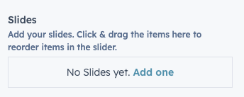
    Repeatable accordion slides. If "2 Column Carousel" is selected, there isn't a maximum set but no more that 6 slides is the recommended amount to ensure the modules doesn't get too tall.

  • Screenshot 2024-02-27 at 3.49.37 PM
    Accordion Slide (2 Column Accordion)

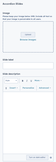
    Options available in Accordion Slide. Options are:

    • Image - phone image
    • Slide Label - title of the slide
    • Slide Description - description of the slide (recommended character count 170)
  • Card Layout & Interaction
    Standard Card Layout & Interaction

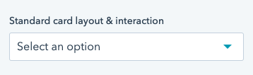
    Appears if "Standard cards" is selected under "Card Type". Options are:

    • Simple card - card with background and text overlay. All information is always visible.
    • Split card - image on top, text on bottom. All information is always visible. Does not support a description.
    • Flip card - card will show background, eyebrow, & title by default, and flip to a solid background and description/link on hover.
    • Hover card - card will show background, eyebrow, & title by default, and display description on hover & link.
  • Standard Card
    Card - Standard Options

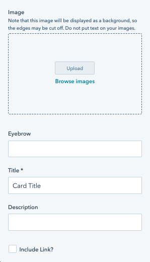
    Options available in full bleed cards. Options are:

    • Image - Apply a background image to your card.
    • Eyebrow - Eyebrow will always be visible on the card.
    • Title - Title will always be visible on the card.
    • Description - Appears on based on option selected in "Standard card layout & interaction".
    • Add link - Check this to add a link to the card. See link. If no link label is applied, an icon will appear (play button for a video modal link, arrow icon for all other links). If a link label is applied, a CTA will appear.
  • Anchor
    Add an anchor

    See Anchor.

Examples

  • Each example has a description of the fields used underneath it.

Your company grows when your people do.

Lorem ipsum dolor sit amet, consectetur adipiscing elit. Phasellus euismod dignissim efficitur. Pellente vestibulum, quam ac convallis mollis.

Your company grows when your people do.

Lorem ipsum dolor sit amet, consectetur adipiscing elit. Phasellus euismod dignissim efficitur. Pellente vestibulum, quam ac convallis mollis.


Fields used:

  • White background
  • Default spacing
  • Card Type - Full bleed cards
  • 4 cards
    • First card links to a URL, with no link label
    • Second card links to a video modal
    • Third card has a CTA
    • Fourth card has no link
    • All cards lack a description, so the text is aligned to the bottom of the card.

Eyebrow content

Your company grows when your people do.

Lorem ipsum dolor sit amet, consectetur adipiscing elit. Phasellus euismod dignissim efficitur. Pellente vestibulum, quam ac convallis mollis, neque leo aliquet enim.
Eyebrow content

Your company grows when your people do.

Lorem ipsum dolor sit amet, consectetur adipiscing elit. Phasellus euismod dignissim efficitur. Pellente vestibulum, quam ac convallis mollis, neque leo aliquet enim.
  1. 1
    Lorem ipsum dolor sit amet

    Whether you want to advance your career or live a healthier life, your BetterUp Coach will have your back. 

    Learn more

  1. 1
    Lorem ipsum dolor sit amet

    Whether you want to advance your career or live a healthier life, your BetterUp Coach will have your back. 

    Learn more

  2. 2
    Lorem ipsum dolor sit amet

    Whether you want to advance your career or live a healthier life, your BetterUp Coach will have your back. 

    Learn more

  3. 3
    Lorem ipsum dolor sit amet, consectetur elit.

    Whether you want to advance your career or live a healthier life, your BetterUp Coach will have your back. 

    Learn more

  4. 4
    Lorem ipsum dolor sit amet

    Whether you want to advance your career or live a healthier life, your BetterUp Coach will have your back. 

    Learn more


Fields used:

  • White background
  • Default spacing
  • Card Type - Full bleed cards
  • 4 cards
    • All cards have a description, so the text is aligned to the top of the card & to the left.


Fields used:

  • White background
  • Default spacing
  • Card Type - Standard Cards
  • Introduction added 
    • Text placement - top of cards
    • Text layout - 2 column split
    • Primary CTA added
  • Standard Card Layout & Interaction - Simple Cards
  • 6 cards
    • First card links to a URL with a Link Label
    • Second Card goes to a link without a label
    • Third card triggers a modal

Eyebrow content

Lorem ipsum dolor sit amet

I'm baby kinfolk mumblecore lomo salvia aesthetic fanny pack typewriter coloring book. Actually put a bird on it letterpress mumblecore cold-pressed kinfolk ennui street art 8-bit ugh. 
Eyebrow content

Lorem ipsum dolor sit amet

I'm baby kinfolk mumblecore lomo salvia aesthetic fanny pack typewriter coloring book. Actually put a bird on it letterpress mumblecore cold-pressed kinfolk ennui street art 8-bit ugh. 
  1. 1
    Select your coach

    Take a quick survey to get personalized Coach recommendations, and choose the Coach that is right for you.

  1. 1
    Select your coach

    Take a quick survey to get personalized Coach recommendations, and choose the Coach that is right for you.

  2. 2
    Schedule a session with your Coach
    Choose a 30 minute session that works for your schedule.
  3. 3
    Connect anytime
    Exchange unlimited messages with your Coach and schedule recurring appointments.


Fields used:

  • Gray background
  • Default spacing
  • Card Type - Standard Cards
  • Introduction added 
    • Text placement - top of cards
    • Text layout - Stacked & Center aligned
  • Standard Card Layout & Interaction - Flip cards
  • 6 cards
    • First card links to a URL without a Link Label
    • Second Card goes to a URL with a label
    • Third card triggers a modal
    • Cards are manually numbered using the eyebrow field.

Note that the flip side of the card is white because the background is gray. If the background is white, the flip side of the card will be black.


Fields used:

  • White background
  • Default spacing
  • Card Type - Standard Cards
  • Introduction added 
    • Text placement - top of cards
    • Text layout - Stacked & Center aligned
    • Title only
  • Standard Card Layout & Interaction - Split cards
  • 4 cards


Fields used:

  • White background
  • Default spacing
  • Card Type - Standard Cards
  • Introduction added 
    • Text placement - Left of cards
    • Primary CTA added
  • Standard Card Layout & Interaction - Hover Cards
  • 6 cards