- Module Library

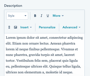
See background. Note that the accordion module only supports a black, white, or gray solid background so that the content remains legible.
See module spacing.

See heading.

See Anchor.
Options are:
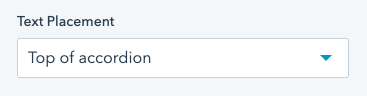
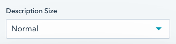
In the introduction dropdown. Choose where the introduction should be placed on desktop. Options are:
Note that the introduction will always appear on top of the accordion on smaller screens.
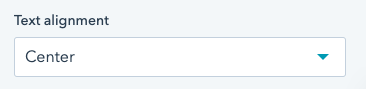
In the introduction dropdown. Only appears if "Text placement" is set to "Top of accordion". Options are:
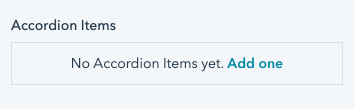
In each accordion item. Add a label to the accordion item. This is the text that will appear when the accordion is closed & open.
In an FAQs structure, this is the question.

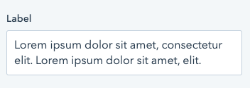
In each accordion item. Add a label to the accordion item. This is the text that will appear when the accordion is open.
In an FAQs structure, this is the answer to the question.